Card printing in Space
Overview
You can create card templates within Space and print these templates as user cards (keys). You can create card templates for different users in your organization. For example, you can create one template for day staff and a different template for night staff.
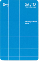 An example of a card design
The card printing functionality is license-dependent. See Registering and licensing Space for more information.
Creating a card template
To create a card template, do the following:
- Select Tools > Card printing. The Card printing screen, with the template list, is displayed.
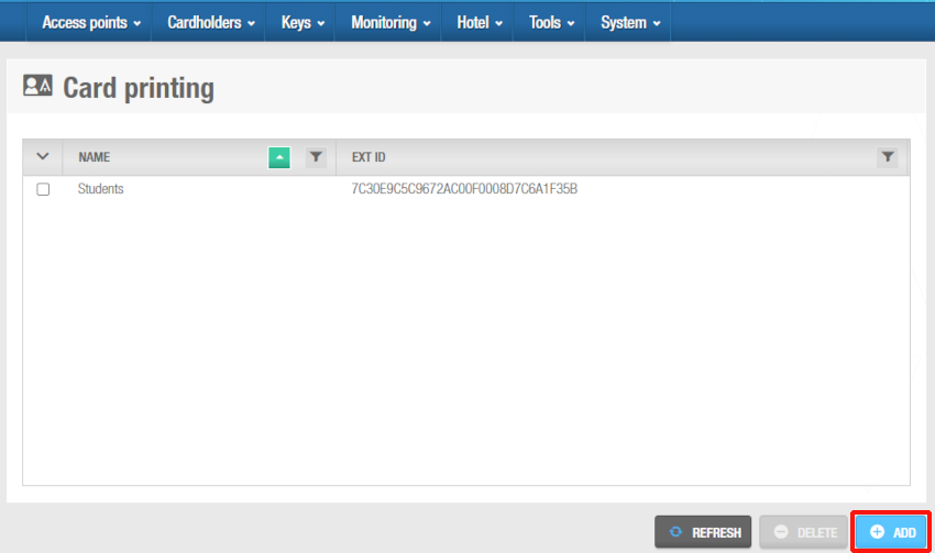 'Card printing' screen
- Click on Add. The Add card printing template dialog box displays.
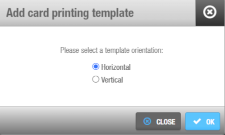 'Add card printing template' dialog box
- Select either Horizontal or Vertical as your template orientation and click OK. The Card template design screen is displayed.
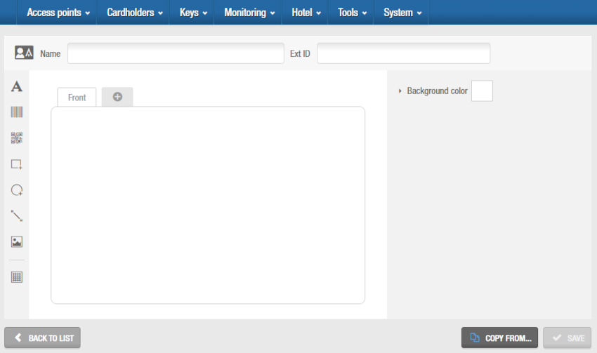 You can design the new card template in this screen
Enter a name for the new card template in the Name field.
If required, you can activate the Ext ID field by adding the SHOW_EXT_ID parameter on System > General options > Advanced. See Advanced tab for more information. The Ext ID field displays a unique identifier for the card template, automatically generated by the system.
Design the card template using the tools on the Toolbar. See next sections for more information on these tools. Select the Front tab to design the front part of the keycard, and the cross icon tab to design the back part of the keycard.
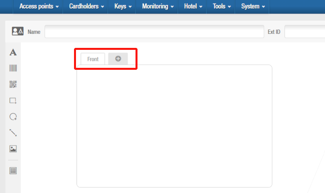 'Front' and 'Back' tabs
When creating a new template, you can start designing it from an existing template by clicking the Copy from button and then selecting the existing template you want to use.
After you create a card template, you can associate it with an individual user in Space. See Using card printing templates for more information.
Toolbar
The toolbar within the Card template design screen is comprised of eight features:
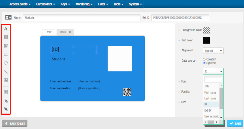 'Text' menu
After you select any of the toolbar features, you can customize it on the blank template in the center of the screen. When you select the feature on the template, a properties menu, specific to the feature, is displayed on the right of the screen.
Note that two more features display in the toolbar only when an element on the template is selected: Send to back and Send to front. These options allow you to move elements to the background or to the front on the template as required.
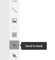 'Send to back' and 'Send to front' features
Text
The Text menu allows you to customize the text used in the template.
The options are described in the following table.
| Option | Description |
|---|---|
| Background color | Background color for the selected text box. |
| Text color | Color of the text on the selected text box. |
| Alignment | Arrangement of the text on the selected text box, for example, Top left. |
| Data source | Allows the text to be defined as Constant (static text) or Dynamic (variable text). If you want the fields in the printed card template to be automatically completed with user data, select Dynamic. When Dynamic is selected, a drop-down menu with the available data fields is activated. |
| Data field drop-down menu | Text field to include in the template, for example, Title, First name, or ID. This drop-down menu is only enabled when Dynamic is selected for Data source. |
| Font | Text font on the selected text box. |
| Position | Position of the text on the template. |
| Size | Height and width of the text. |
Barcode
The Barcode menu allows you to customize a barcode on the template. Adding a barcode might be useful if you want the card to also be scannable. For example, students could also use the card as a library card to loan books.
The options are described in the following table.
| Option | Description |
|---|---|
| Data source | Allows the barcode to be defined as Constant (static) or Dynamic (variable). If you want the barcode in the printed card template to represent a specific field and that it is automatically completed with user data, select Dynamic. When Dynamic is selected, a drop-down menu with the available data fields is activated. |
| Font | Barcode type, such as Code 128 or Code 39 on the template. |
| Position | Position of the barcode on the template. |
| Size | Width of the barcode. |
QR code
The QR menu allows you to customize a QR on the template. Adding a QR code might be useful if you want the card to be scannable. For example, cards which are issued for an event could include a link to website which contains the event details.
The options are described in the following table.
| Option | Description |
|---|---|
| Data source | Allows the QR to be defined as Constant (static) or Dynamic (variable). If you want the QR in the printed card template to represent a specific field and that it is automatically completed with user data, select Dynamic. When Dynamic is selected, a drop-down menu with the available data fields is activated. |
| Position | Position of the QR on the template. |
| Size | Width of the QR. |
Rectangle
The Rectangle menu allows you to customize rectangles on the template.
The options are described in the following table.
| Option | Description |
|---|---|
| Background color | Background color for the rectangle. |
| Line color | Line color for the rectangle. |
| Line thickness | Line thickness of the rectangle. |
| Position | Position of the rectangle on the template. |
| Size | Size of the rectangle on the template. You can specify the height and width. |
Ellipse
The Ellipse menu allows you to customize ellipses on the template.
The options are described in the following table.
| Option | Description |
|---|---|
| Background color | Background color for the ellipse. |
| Line color | Line color for the ellipse. |
| Line thickness | Line thickness of the ellipse. |
| Position | Position of the ellipse on the template. |
| Size | Size of the ellipse on the template. You can specify the height and width. |
Line
The Line menu allows you to customize lines on the template.
The options are described in the following table.
| Option | Description |
|---|---|
| Background color | Background color of the line. |
| Line color | Color of the line. |
| Line thickness | Thickness of the line. |
| Direction | Direction of the line. |
| Position | Position of the line on the template. |
| Size | Size of the line on the template. You can specify the height and width. |
Image
The Image menu allows you to customize images on the template.
The options are described in the following table.
| Option | Description |
|---|---|
| Background color | Background color for the image. |
| Image mode | Arrangement of the image on the template, for example, Scaled. |
| Data source | If you select Constant, you will be able to upload an image for this template. If you select User picture, the image available in the User information screen will be used. See Adding user images for more information. |
| Position | Position of the image on the template. |
| Size | Height and width of the image. |
Grid
The Grid menu allows you to use a grid reference to place design elements accurately
Select the Show grid checkbox for the grid to be displayed. You can also select the size of the grid by using the up and down arrows.
Using card printing templates
After you create your card templates, you can print these as user cards (keys) in Space using a standard ID card printer.
To print card templates, do the following:
Select Cardholders > Users.
Select the user associated with the card template to print. The User information screen is displayed.
In the Card printing template panel, select the corresponding card printing template.
Save the changes. The Print button is now enabled.
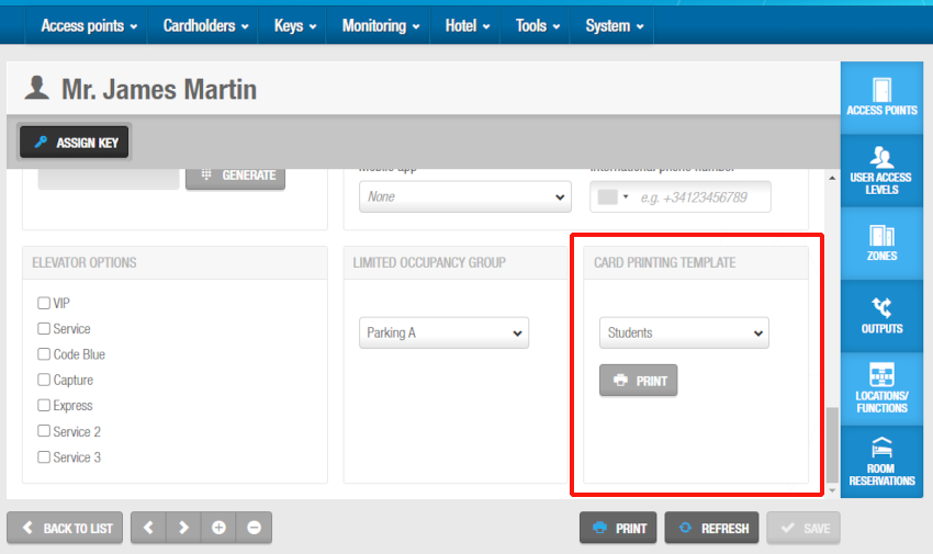 'Print users cards' screen
- Click Print. The Preview screen is displayed.
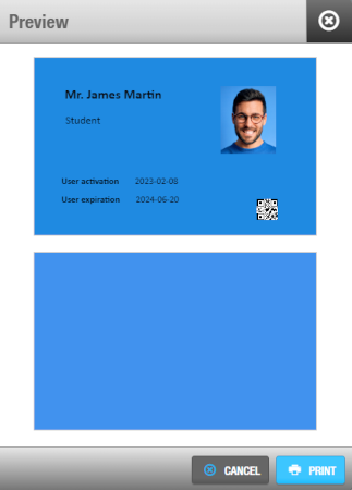 Card preview
Click on Print.
Select the rest of the printing options in the following dialog box and print the templates. The templates are then printed.
 Back
Back
